Global Offices


Beyond Aesthetics: How Color Psychology Shapes Public Seating and Spatial Behavior
Across large public spaces, seating is often one of the most visually prominent elements. It occupies substantial floor area, is repeated throughout the space, and is frequently among the first features users notice.
Yet color selection for public seating goes far beyond aesthetics. Color can shape the atmosphere and visual identity of an environment while also serving as an intuitive, efficient, and relatively cost-effective spatial management tool.

How Does Color Influence the Public Space Experience?
- Emotional Response: Cool tones such as blue and green are often associated with calmer, more relaxed visual environments, while warmer tones such as red and orange can add energy, warmth, and stronger visual stimulation.
- Behavioral Tendencies: Highly saturated colors can reinforce a more energetic, interactive atmosphere, while muted or darker palettes are often better suited to areas designed for concentration, quiet waiting, or longer stays.
- Spatial Recognition: In large, complex buildings, seating color can support visual wayfinding. Different colors can help users identify VIP areas, short-stay zones, children’s areas, or other functional spaces more quickly.
Common Mistakes in Public Seating Color Selection
- Relying on Fixed Color Rules
There is no one-size-fits-all approach to color. Each space has its own function and character, so seating colors should be tailored to its intended purpose and experience.
- Using Too Many Colors
Excessive color coding creates visual noise and can make a space feel less organized. The palette should distinguish functions without competing with the wider interior and wayfinding system.
- Ignoring Lighting and Physical Samples
Digital renderings cannot fully predict how upholstery will look in real conditions. Warm light, cool light, and low-light cinema conditions can all change how a color appears, so physical samples should be reviewed under lighting conditions close to the actual project environment.
Color Strategies for Public Seating in Different Settings
Public seating should be specified according to spatial function, dwell time, user profile, and overall design language.
- Auditoriums and Theaters
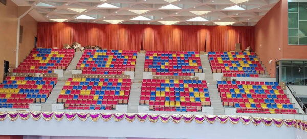
Performance halls, academic auditoriums, and conference venues serve different purposes, so the seating palette should reinforce the character of the space. Because large seating blocks carry strong visual weight, colors should remain restrained enough to keep the stage as the primary focal point.

Color Guidance
- Refined, Cultural Tones: Burgundy, deep navy, forest green, and rich brown suit traditional theaters and performing arts venues, adding depth without appearing overly decorative.
- Professional Neutrals: Gray, blue-gray, and warm gray are more appropriate for academic and conference settings, where a restrained palette supports a clearer professional identity.
- Layered Zoning: In larger venues, subtle shifts within one color family can distinguish sections without fragmenting the overall visual composition.
- Cinemas
Cinema viewing takes place primarily in low-light conditions, so seating should remain visually subdued and avoid drawing attention away from the screen. In VIP or upscale cinemas, seating colors also contribute to a stronger sense of comfort, privacy, and overall quality.

Color Guidance
- Prioritize Darker Tones: Deep red, burgundy, navy, forest green, black, and charcoal are well suited to cinema interiors, where they remain understated under dim lighting.
- Control Surface Reflectivity: The same color can appear very different across leather, fabric, and other upholstery materials. Low-reflectance materials are therefore best evaluated under actual lighting conditions before final selection.
- Add Depth Through Materials: In premium screening rooms, leather, fabric, texture, or subtle finish variations can enrich a dark palette without introducing unnecessary colors. A deep red leather recliner can also serve as a refined visual accent.
- Schools and Educational Spaces
Educational spaces should feel engaging without allowing color to become a constant source of distraction, while balancing visual stability with campus vitality.

Color Guidance
- Low-Stimulus Tones for Focus Areas: Libraries and study rooms can draw on soft gray-blue, off-white, and light wood tones to limit visual load.
- Brighter Accents for Interactive Areas: Seminar rooms, activity centers, and innovation spaces can feature touches of orange, green, or yellow to bring greater openness and energy to the setting.
- Control High-Saturation Colors: In spaces intended for prolonged study, multiple highly saturated shades should not dominate large surfaces. A restrained base palette with selective accent colors establishes a clearer visual hierarchy.
- Airports, Stations, and Public Transit Spaces
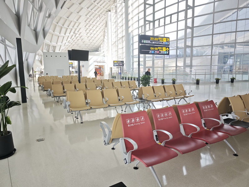
Large transportation hubs are often complex and crowded, so seating color can help passengers understand the purpose of different zones quickly and intuitively.
Color Guidance
- Functional Color Coding: Clear contrasts in hue or brightness can distinguish gate areas, waiting zones, and short-stay spaces while improving visibility from a distance. For airport seating, these distinctions can make large terminal layouts easier to read.
- Stable Tones for Longer Stays: Charging areas, business zones, and VIP lounges are better suited to charcoal, brown, blue-gray, and other restrained neutrals that remain visually comfortable over longer periods.
- Support Color with Other Cues: When seating colors differentiate zones, accompanying text, numbers, or icons keep wayfinding clear for a wider range of users.
- Hospitals and Healthcare Waiting Areas
Healthcare environments can feel highly functional and institutional. Seating colors can soften this visual impression and make waiting areas feel more approachable.

Color Guidance
- Softer Tones for General Waiting Areas: Blue, green, blue-green, and muted neutrals lend larger waiting spaces a calmer, fresher visual character.
- Controlled Bright Accents for Pediatric Areas: Yellow, orange, and other brighter tones can be applied selectively, helping children’s areas feel less formal without becoming visually overwhelming.
- Factor Maintenance into Color Selection: High-use waiting area chairs require frequent cleaning and disinfection, so color and material choices should also account for stain resistance, post-cleaning color variation, and long-term color stability.
Leadcom Public Seating Solutions
Even the most thoughtful color strategy ultimately depends on how it is expressed through seating materials, finishes, and structure. The same shade can look noticeably different on fabric, leather, wood veneer, or plastic surfaces.
Backed by extensive experience in public seating, Leadcom’s seating solutions are developed with color, material performance, spatial function, and long-term maintenance requirements in mind.
- ARCADIA PLUS WOOD LS-20603W
ARCADIA PLUS WOOD LS-20603W combines upholstered seating with wood finishes for auditoriums, theaters, and worship spaces.
The outer back and seat pan feature wood-veneered plywood, paired with cold-molded seat and back cushions and hardwood armrests.
For worship spaces with wooden church chairs, multiple upholstery and wood-finish options make it easier to coordinate church sanctuary chair colors with carpeting, wall finishes, and interior woodwork.
- Maestro LS-813B Recliner on Riser
Maestro LS-813B Recliner on Riser features a dual-motor reclining design and can be installed directly on existing risers, minimizing additional renovation when upgrading conventional cinema seating to VIP seating.
Low-reflectance upholstery or carefully selected finishes can complement dark cinema interiors while minimizing unwanted reflections.
- Titan Flex L-E03
Titan Flex L-E03 features a PP back, padded PP seat, durable laminated plywood tabletop, and powder-coated cold-rolled steel supports, a material combination well suited to everyday educational environments.
A stable primary palette can be paired with subtle color variations on the tabletop or selected components, balancing functionality with the energy of campus spaces.
- ACE Elite L-W02-2
ACE Elite L-W02-2 is a flexible tandem seating solution for airports, hospitals, and other high-traffic waiting environments.
It can be fitted with tables and arranged in straight rows, back-to-back layouts, or grouped configurations. This flexibility supports clearer zoning through a combination of seating layout and color.
Conclusion
Color is more than a finishing touch in public seating design. The right palette can support wayfinding, reinforce spatial identity, and help seating respond more effectively to the function of each environment.
With flexible material, upholstery, and finish options, Leadcom helps turn color strategies into practical seating solutions for auditoriums, cinemas, schools, transport hubs, and healthcare spaces. Contact us to discuss your space, material, and color requirements.